Why I Prefer Arc to Safari for My Mac: A Look at Three Key Advantages

Why I Prefer Arc to Safari for My Mac: A Look at Three Key Advantages
Key Takeaways
- Arc browser has neat features like AI-powered automatic renaming of downloads, making workflows more organized and efficient.
- Little Arc Windows provide a non-disruptive way to view links, enhancing web browsing experience with temporary pop-up windows.
- Profiles and vertical tabs in Arc allow for work-life separation, keeping different accounts and browsing histories separate for better balance.
I would never argue that Safari isn’t the best browser to use on a Mac, and yet, the Arc browser has managed to keep me away. These are the three primary reasons I keep opening Arc, and why you may want to give it a shot too.
What Is Arc?
Briefly, the Arc browser is just that, a web browser. It’s built on Chromium, which means it can access Chrome extensions and other tricks, but Arc has revved the interface, stripped out Google stuff, and given it a lot of bells and whistles. (This is about Arc on Macs, but the browser is available for Windows 11 and Windows 10 now too.)
Automatic Renaming of Downloads

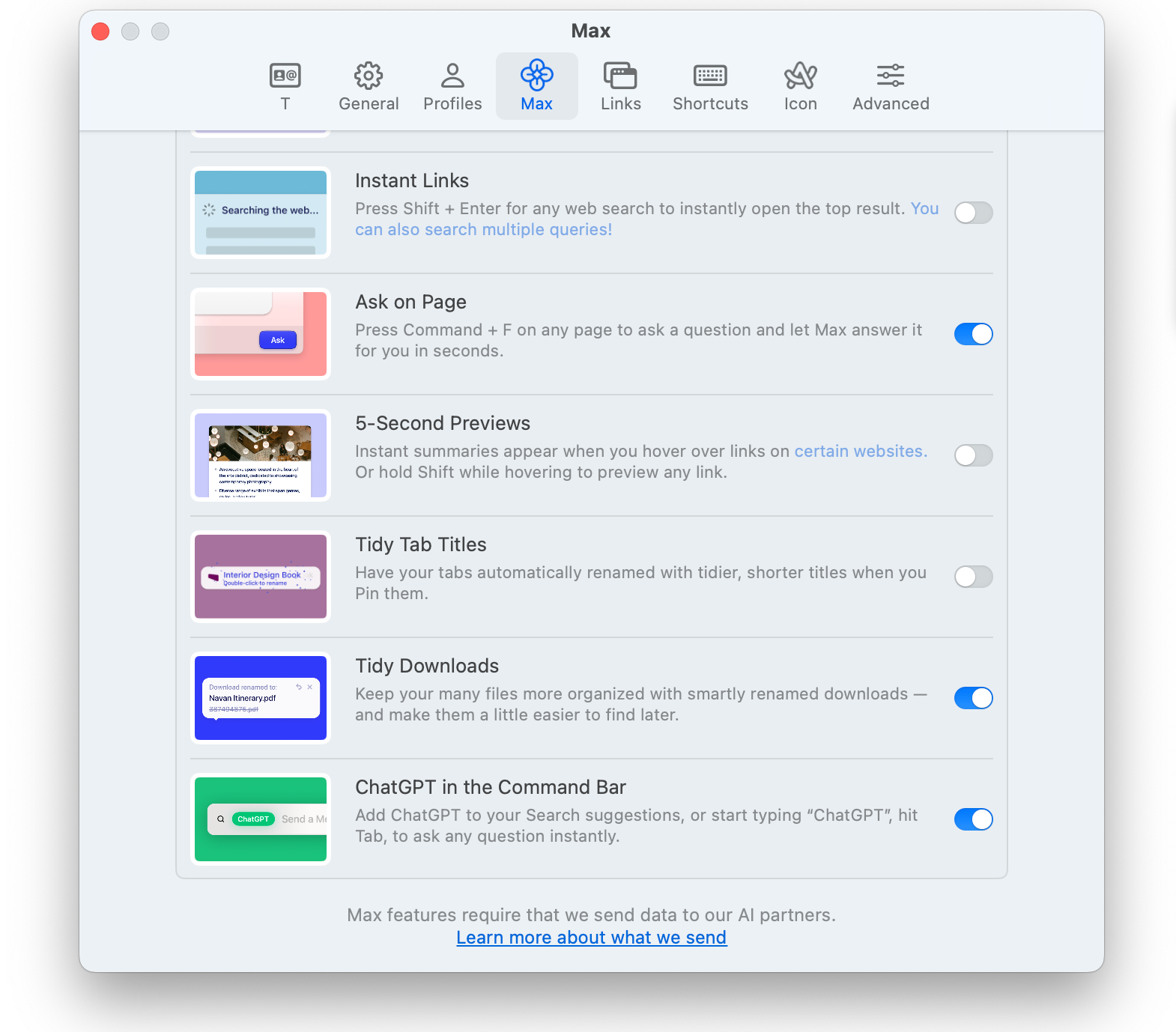
As part of Arc’s AI suite called “Max,” the Tidy Downloads feature tries to smartly rename downloads to keep things more organized. I’m constantly downloading images and screenshots for work and was faced with looking at random names like D092331.jpg later in my Downloads folder.
The name conversion happens at the time of download and will show the old name crossed out with the new, AI-generated name in place.
At first, the feature confused me because I couldn’t figure out why some things had slightly different names and why everything had a readable name, instead of random letters and numbers. The Tidy Downloads feature can be turned off if it’s messing with your workflow, but you can also undo each instance if it messes up occasionally. I would hate to fully give it up. It has taken a lot of the tedious work out of my workflow and it’s been fantastic.
(By the way, there is a similar feature called Tidy Tab Names that will do the same thing to, you guessed it, tab names.)
Little Arc Windows Are a Delight

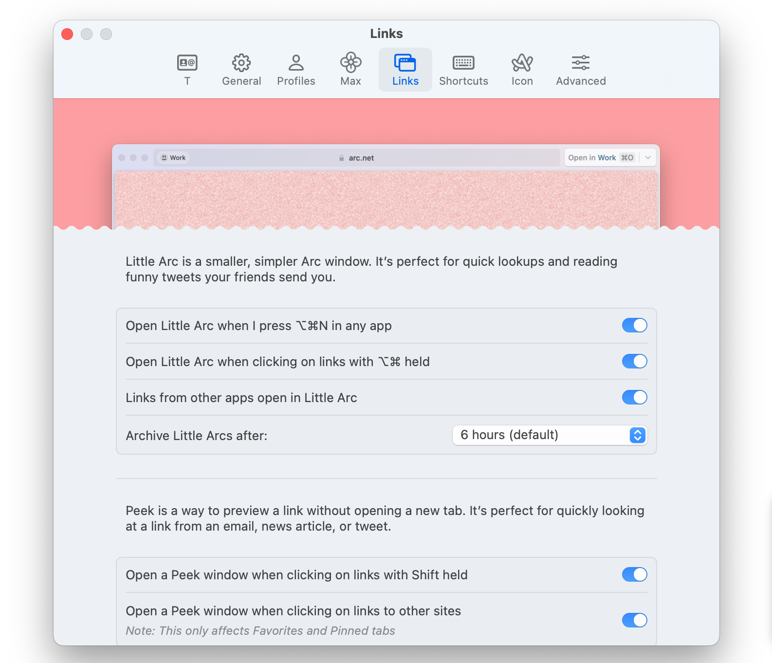
Browsing the web, as in actually meandering around, can feel disjointed with Safari or Chrome. When you click on a link it jolts you over to a new space (tab) or shuffles you away from your current page. (Hopefully you remember what it was!) Little Arc Windows are pop-up windows that appear in front of your current page when you click a link, and then disappear when you close them. They’re meant to be ephemeral.
The idea is that a Little Arc Window can pop up in front of what you’re doing as a temporary view. You can quickly close it to go back to what you were doing. If you decide you want the page to stick around then you can add it as a tab with one more click.
This is probably the feature I wish Apple would copy the most with Safari. These mini pop-up windows that appear for temporary views make side tasks very easy to accomplish without disrupting a workflow, or more general web browsing.
Again, if you don’t like Little Arc Windows you can turn them off, but they’re fast and I’ve never had one lose my place when adding it as a more permanent tab.
Work-Life Separation With Profiles (and Vertical Tabs)

Vertical tabs down the left side of the Arc browser took some time to get used to. Now that I have, I would be hard-pressed to go back. My Studio Display is wider than it is tall, which means moving the toolbars across the top to the side gives websites a bit more room, top to bottom.
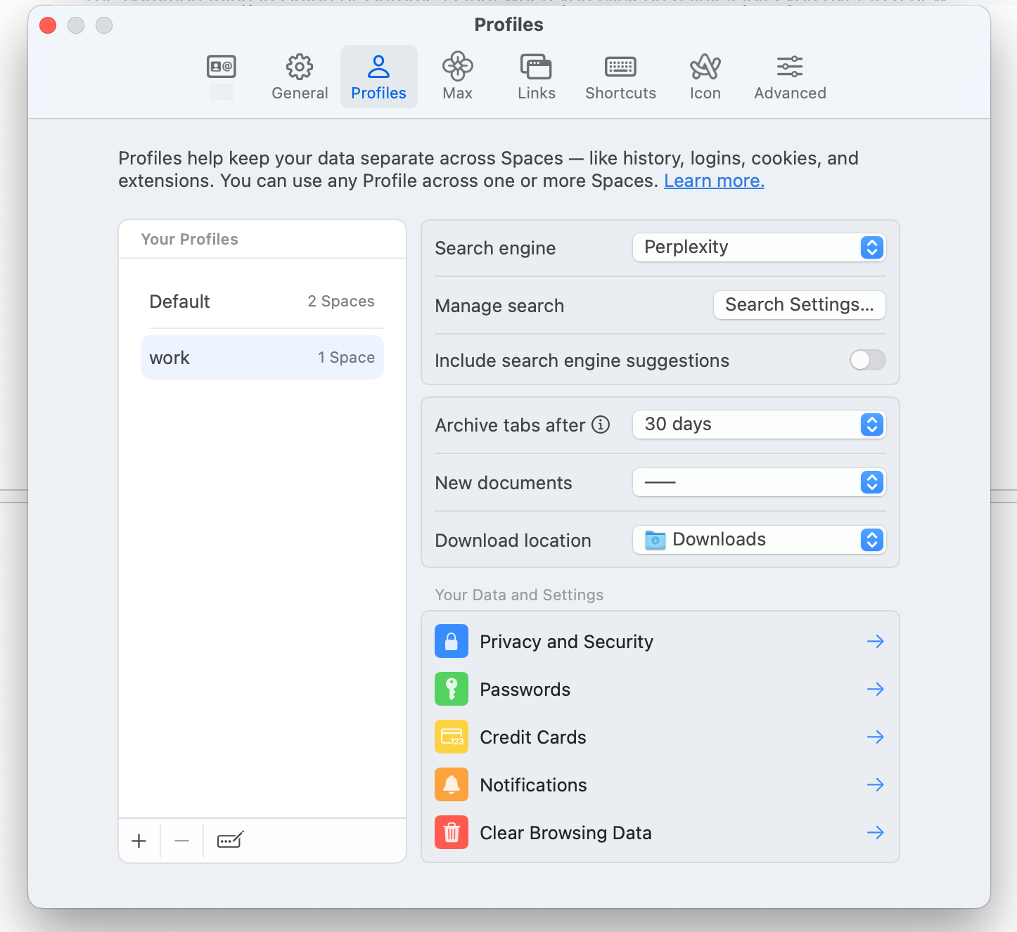
Vertical tabs in the sidebar come into play with space and profiles because you can swipe back and forth between the different ones. Each space can have a different color and icon. Then each space can have a different profile, so your work Gmail account and your personal one can be signed in without confusing Google. History and passwords can also be separated for a better sense of work-life balance.
Among different profiles, you can also have different pinned tabs at the top. Safari is getting into the different profiles game, so this is not totally foreign, but I do think Arc’s implementation is much slicker. Safari’s is a more manual process, while Arc’s ability to swipe through is more conducive to using more frequently.
The Extras
Of course, Arc has a lot of other features tucked in beyond these three that make it nice and convenient. It’s working on bolstering its mobile browser story for syncing too. But if you need some very specific reasons to give Arc a chance, these three features add a lot to the experience.
Also read:
- [New] In 2024, Night's Tale Videos Critical Take
- [New] MAGIX Photographic Mastery An In-Depth Review for 2024
- [New] The Complete Business Guide to Facebook Marketing Mastery
- [Updated] Capture & Share The Art of Using Zoom's Snaps for 2024
- [Updated] Essential Guide to Adding SRT To MP4s, Updated for 2024
- [Updated] Top Picks of Engaging Click-Based PC Gaming for 2024
- 2024 Approved Capture Your Desktop on Windows, 3 Ways, Free
- Discover the Ultimate Metaverse Glasses Selection
- In 2024, Combatting iPhone's Difficulty in Autofocusing
- In 2024, SJ7's Pioneering Tech in the Action Space A Complete 4K Starcam Review
- Proper Planning: Essential Steps for Using WSL 2 Right
- Streaming Strategy Is VLC Worthy to Challenge MPC for 2024
- Top Methods for Converting WAV Files to WMA Format Using Batch Processing in Windows
- Top Prime Day Bargains on OnePlus
- Title: Why I Prefer Arc to Safari for My Mac: A Look at Three Key Advantages
- Author: Edward
- Created at : 2025-01-22 22:16:14
- Updated at : 2025-01-24 00:30:53
- Link: https://vp-tips.techidaily.com/why-i-prefer-arc-to-safari-for-my-mac-a-look-at-three-key-advantages/
- License: This work is licensed under CC BY-NC-SA 4.0.